[GeoIP and Spam]
[Spam Discounts]
[RBL Services]
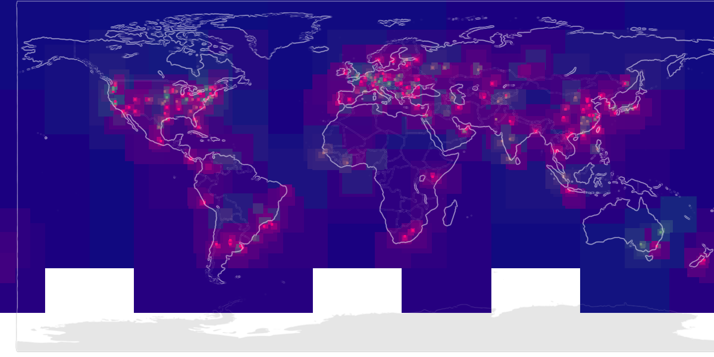
The World According to Spam
A map of places in the world that send me spam.
Color key:
- Green..Red
- Innocent Mailer..Evil Spammer. This is a continuous spectrum and mixed colors are possible: e.g., a region that generates 50% spam and 50% non-spam would be yellow.
- Blue
- The proportion of blue color indicates the distance from the source data. Strong red or green colors are closer to mail sources, while strong blue areas are distant from mail sources.
- White/Gray
- No Bayes token exists for this region.
[GeoIP and Spam]
[Spam Discounts]
[RBL Services]